Welcome to Arch UI
DraftThe Arch design system defines the foundations of the user interface. It brings all product experiences together under a single, unified framework.
Design tokens
Tokens are a set of foundational design decisions represented as reusable data. These tokens are shared across all platforms, iOS, Android, and Web, and control the entire visual part of our design system.

Color
A two-tier system of primitive palettes and semantic tokens that keeps every surface, text, and border themeable without touching component code.

Typography
Arch typography is flexible and modular and can be used in various ways. Below are the principles behind how our type system was created and examples of how it can be used.
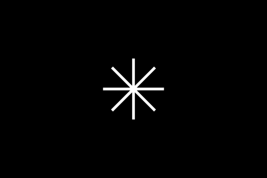
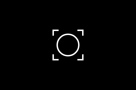
Icons
Our icon system is built for clarity and consistency. It aims to be bold, communicative, and functional, complementing typography and fitting naturally within every component.
Spacing
Arch UI leverages standard sizes and spacing created from increments of 4. This provides consistent sizing and components that snap into place.
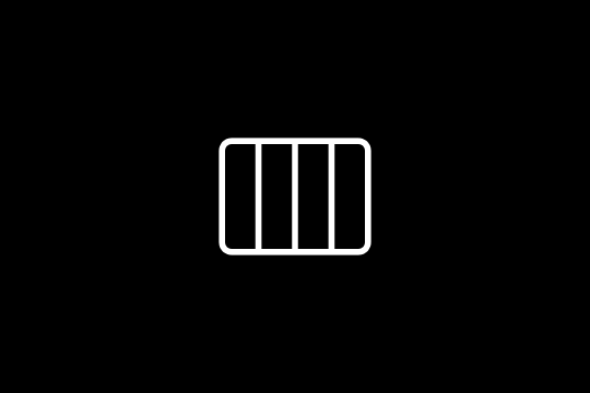
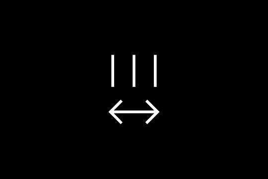
Layout grids
We use layout grids to ensure that our content aligns properly on the page.
Corner radius
Arch UI allows for rounded corners to a variety of components. For simple reference, the metric values for corner radius are 16, 12, 8, and 4. These radius metrics are dependent on the size of the component that it is applied to.

Elevation
Elevation provides cues about the surface depth and stacking order of elements in an experience.

Motion
Tokenised duration and easing values that communicate relationships, provide feedback, and guide attention cohesively.
Accessibility
WCAG 2.1 AA conformance out of the box — semantic HTML, keyboard support, and screen reader compatibility in every component.