Design tokens
DraftTokens are a set of foundational design decisions represented as reusable data. These tokens are shared across all platforms, iOS, Android, and Web, and control the entire visual part of our design system.
- Usage
- Tokens
- Code
- Status & changelog
Anatomy
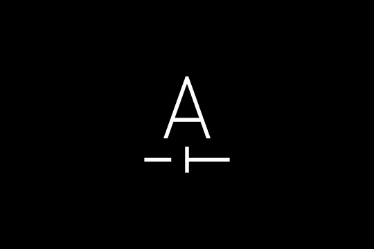
Each design token has a unique name and its corresponding value. This name/value pairing is similar to a dictionary data structure found in engineering, where a key is associated with a value, and the key/value pair can be used to store and retrieve data.
Name (required)
The most integral part of a design token is its name — it is how it will be known and referenced across all platforms.
Naming is inherently complex — you can always reference the naming convention of each token type on its respective documentation page for more details.
There are two main properties when thinking of how we construct the name of a design token, its Tier and Type.
Type
There are established formats and best practices for naming we follow based on the token type (color, typography, sizing, etc.) to ensure high comprehension and usability for designers and developers alike.
Tier
Depending on how context specific a design token is, its naming can vary. For our most foundational tier, naming will often consist of the token type, followed by a numeric or ordinal scale. The more narrow the token's intended usage is, the more precise its name will be.
Type (optional)
While design tokens can represent any design decision, there are a handful of established token types in W3C that summarize the purpose of the token and are often referenced by our tooling.
| Name | Definition |
|---|---|
| Color | Color values, including both named colors and hexadecimal values. |
| Dimension | Numeric values with units, such as pixels or ems. |
| Font family | Font families, such as "Inter". |
| Font-weight | Font weights, such as "bold" or "normal". |
| Duration | Time durations, such as "0.5s" or "2ms". |
| Cubic Bezier | Easing functions with cubic Bezier curves. |
| Number | Simple numeric values without units. |
Value (required)
A design token's value is the specific data that defines a design property and is associated with a particular token name. Depending on the token and its complexity, there are several types of data supported:
Data types
| Data type | Description |
|---|---|
| String | A sequence of characters that can represent text, such as font or color names. |
| Number | A numerical value that can represent various design properties, such as size, spacing, or duration. |
| Color | A value that represents a specific color, typically in hexadecimal or RGB format. |
| Boolean | A value that is either true or false, and can be used to represent binary properties such as whether an element is visible or hidden. |
| Object | A collection of key/value pairs, which can be used to represent more complex design properties, such as gradients or shadows. |
| Array | A collection of values of the same data type, such as a list of font sizes or spacing values. |
| Null | A special value that represents the absence of a value. |
Composite tokens
The last tier of tokens supported is a composite — a token that combines or derives its value from one or more child tokens. Composite tokens are created by specifying a calculation or formula that references other tokens as input values and uses those values to produce a new output value.
There are two main use cases for composite tokens — supporting calculation-based value reference (such as dynamic sizing of a component) and defining more complex component tier tokens (card, tile, etc.)
Composite types
W3C currently recognizes 6 composite token types.
| Type | Definition |
|---|---|
| Stroke | Composite of an array of widths (dashArray) and a string to define the shape (lineCap) property. |
| Border | Composite of a color token, width number, and style object (usually a stroke composite). |
| Transition | Composite of duration, delay, and a timing array. |
| Shadow | Composite of a color token, X and Y offsets, blur, and spread. |
| Gradient | Composite of color tokens and a finite amount of positions they take. |
| Typography | Composite of a font family, size, weight, letter spacing, and line height. |
Group vs composite tokens
Composite tokens are not to be mistaken for group tokens. A group token does not have a value of its own but simply serves as a container or grouping mechanism for related tokens. Group tokens can be used to organize related tokens by category or context, such as color tokens for a specific brand or typography tokens for a specific component.
Description (optional)
Beyond name and value, a design token can have a description property to provide additional information to the user. It's most often used to:
- Provide purpose & context
- Provide usage guidance
- Any relevant design considerations
- Caveats & Limitations
W3C Definition & Format
"Design tokens are a methodology for expressing design decisions in a platform-agnostic way so that they can be shared across different disciplines, tools, and technologies. They help establish a common vocabulary across organizations." — W3C Design Tokens
We aim to be as close to the proposed W3C design token format and follow best practices, however, we will be holding off on doing a migration to achieve full compliance until its official release.
Resources
Tiers
Design tokens follow a 3 tier model based on whether the token stores an option or a decision. Each tier is referenced by the one above it (refer to as aliasing).
color-blue-600color-action-primarybutton-bg-defaultinput-border-focuscolor-text-infobadge-text-infoalert-text-infoPrimitive tokens
Primitive tokens store all the raw data in a platform and usage-agnostic way. In most cases, this level of tokens is not intended for standalone usage and serves as a foundational level of abstraction.
File location: packages/tokens/src/primitive/
color-gray-50       →  #F3F3F3
color-blue-600      →  #266EF1
color-red-600       →  #DE1135
spacing-4           →  4px
spacing-16          →  16px
radius-sm           →  4px
radius-md           →  8px
shadow-sm           →  0 1px 4px hsla(0, 0%, 0%, 0.16)
motion-duration-fast →  100ms
Semantic tokens
A semantic token, also known as an alias token, is an abstraction layer that reflects the usage of a value in the UI instead of the literal value.
File location: packages/tokens/src/semantic/
color-background-default     →  {color.white}        →  #FFFFFF
color-text-default           →  {color.gray.900}     →  #282828
color-text-subtle            →  {color.gray.600}     →  #727272
color-action-primary         →  {color.blue.600}     →  #266EF1
color-action-primary-hover   →  {color.blue.700}     →  #175BCC
color-action-destructive     →  {color.red.600}      →  #DE1135
color-border-focus           →  {color.blue.500}     →  #068BEE
color-feedback-success-bg    →  {color.green.50}     →  #EAF6ED
spacing-component-md         →  {spacing.12}         →  12px
radius-component-md          →  {radius.md}          →  8px
shadow-component-sm          →  {shadow.sm}          →  0 1px 4px ...
Component-specific tokens
Component-specific tokens are primarily found in our codebases and not so much in Figma. Their primary role is to represent the properties associated with a component.
Unlike the previous two tiers, these tokens are self-contained, meaning modifying the underlying value of the token will not affect anything outside the component it's used in.
File location: packages/tokens/src/component/
button-bg-default    →  {color-action-primary}
button-bg-hover      →  {color-action-primary-hover}
button-text-default  →  {color-action-primary-text}
input-border-default →  {color-border-default}
input-border-focus   →  {color-border-focus}
Principles
Shared language
Design tokens provide a common language between designers and developers.
Consistency
Remember that it takes a long time to cement a consistent "feel" with our users, but it takes very little to break it. Design tokens ensure consistency in our design system, connecting each element to a predefined style and, therefore, a design token.
Reusability
Design tokens provide a predefined set of options that can be applied to multiple use cases across our system, driving system adoption on the subcomponent level.
Using raw values directly in code is poor practice for maintenance and future changes, mainly because we support themes and accessibility features like Dark Mode. Proper tokens allow themes to work seamlessly across multiple platforms -- iOS, Android, and the Web.
These styles have been defined with a system in mind; the moment you deviate from them, you break this system. By adhering to this system instead, you help consolidate a distinctive look & feel driven by our brand guidelines.
Supported types
Arch UI defines tokens across 8 categories. Each category has its own foundation page with detailed values and usage guidance.

Color
A two-tier system of primitive palettes and semantic tokens that keeps every surface, text, and border themeable without touching component code.
Typography
Arch typography is flexible and modular and can be used in various ways. Below are the principles behind how our type system was created and examples of how it can be used.
Icons
Our icon system is built for clarity and consistency. It aims to be bold, communicative, and functional, complementing typography and fitting naturally within every component.
Spacing
Arch UI leverages standard sizes and spacing created from increments of 4. This provides consistent sizing and components that snap into place.
Layout grids
We use layout grids to ensure that our content aligns properly on the page.

Corner radius
Arch UI allows for rounded corners to a variety of components. For simple reference, the metric values for corner radius are 16, 12, 8, and 4. These radius metrics are dependent on the size of the component that it is applied to.

Elevation
Elevation provides cues about the surface depth and stacking order of elements in an experience.

Motion
Tokenised duration and easing values that communicate relationships, provide feedback, and guide attention cohesively.

Accessibility
WCAG 2.1 AA conformance out of the box — semantic HTML, keyboard support, and screen reader compatibility in every component.
Naming convention
All tokens follow a consistent pattern that reads left to right, from broad category to specific variant:
[category]-[concept]-[variant?]-[state?]
| Segment | Purpose | Examples |
|---|---|---|
| Category | What kind of value | color, spacing, radius, shadow |
| Concept | What role it plays | action, background, component, text |
| Variant | Which variation | primary, subtle, sm, lg |
| State | Interactive state | hover, active, disabled |
In CSS output, tokens become custom properties prefixed with -- and hyphen-separated:
--color-action-primary
--color-action-primary-hover
--spacing-component-md
--radius-component-sm
--shadow-component-md
Token inventory
Arch UI ships tokens across 8 categories. The table below shows the token count for each category and links to its detailed foundation page.
| Category | Tokens | Primitive file | Semantic file | Foundation page |
|---|---|---|---|---|
| Color | 240 | primitive/color.json | semantic/color.json | Color |
| Typography | 129 | primitive/typography.json | semantic/typography.json | Typography |
| Spacing | 37 | primitive/spacing.json | semantic/spacing.json | Spacing |
| Motion | 19 | primitive/motion.json | semantic/motion.json | Motion |
| Z-index | 17 | primitive/z-index.json | semantic/z-index.json | -- |
| Shadow | 14 | primitive/shadow.json | semantic/shadow.json | Elevation |
| Radius | 12 | primitive/radius.json | semantic/radius.json | Corner Radius |
| Border | 6 | primitive/border-width.json | semantic/border-width.json | Border |
Color tokens
Primitive -- 12 color scales (gray, blue, red, green, yellow, orange, purple, teal, magenta, lime, amber) plus white and black. Each scale runs from 50 (lightest) to 900 (darkest).
Semantic -- organized into 7 groups:
| Group | Purpose | Examples |
|---|---|---|
color-background-* | Surface and page backgrounds | default, subtle, muted, inverse, disabled, overlay |
color-text-* | Text and label colors | default, subtle, placeholder, disabled, inverse, link, danger, success, warning, info |
color-action-* | Interactive element fills | primary, primary-hover, secondary, ghost, destructive (each with -hover, -active, -text variants) |
color-border-* | Border and divider colors | default, subtle, strong, focus, danger, success, warning, disabled |
color-feedback-* | Status and alert backgrounds | danger-bg, danger-text, danger-border, success-*, warning-*, info-* |
color-surface-* | Elevation layers | base, raised, overlay, sunken |
color-icon-* | Icon fill colors | default, subtle, disabled, inverse, danger, success, warning, info |
See Color foundation page for full swatches and values.
Typography tokens
Primitive -- individual scales for family (sans, mono, serif), size (11px--96px), weight (regular--extrabold), line-height (1--112px), and letter-spacing (tighter--wider).
Semantic -- a type scale with composite tokens for each style:
| Scale | Sizes available |
|---|---|
| Display | large, medium, small, xsmall |
| Heading | xxlarge, xlarge, large, medium, small, xsmall |
| Label | large, medium, small, xsmall |
| Paragraph | large, medium, small, xsmall |
| Code | md, sm |
Each scale entry includes font-size, line-height, font-weight, and letter-spacing.
See Typography foundation page for the full type scale.
Spacing tokens
Primitive -- a linear scale from 0 to 128: 0, 1, 2, 4, 6, 8, 10, 12, 14, 16, 18, 20, 22, 24, 28, 32, 36, 40, 48, 56, 64, 80, 96, 112, 128.
Semantic -- three groups:
| Group | Tokens | Purpose |
|---|---|---|
spacing-layout-* | page-gutter, section-gap, content-gap | Page-level spacing |
spacing-component-* | xs, sm, md, lg, xl | Padding and gap inside components |
spacing-inline-* | xs, sm, md, lg | Small gaps between inline elements |
See Spacing foundation page for the full scale.
Radius tokens
Primitive -- none (0px), xs (2px), sm (4px), md (8px), lg (12px), xl (16px), 2xl (24px), full (9999px).
Semantic -- radius-component-sm, radius-component-md, radius-component-lg, radius-component-full.
See Corner Radius foundation page.
Shadow tokens
Primitive -- xs, sm, md, lg, xl, 2xl, inner, shallow-above, shallow-below, deep-above, deep-below.
Semantic -- shadow-component-sm, shadow-component-md, shadow-overlay.
See Elevation foundation page.
Motion tokens
Primitive -- durations (instant, fast, normal, slow, slower) and easings (linear, ease-in, ease-out, ease-in-out, spring, bounce).
Semantic -- motion-semantic-duration-instant through duration-slower, plus easing-default, easing-enter, easing-exit.
Border tokens
Primitive -- border-width-none (0px), border-width-thin (1px), border-width-medium (2px), border-width-thick (4px).
Semantic -- border-width-default (aliases thin), border-width-strong (aliases medium).
Z-index tokens
Primitive -- a stepped scale for stacking context:
| Token | Value | Use case |
|---|---|---|
z-hide | -1 | Hidden elements |
z-base | 0 | Default stacking |
z-raised | 10 | Slightly elevated content |
z-dropdown | 100 | Dropdown menus |
z-sticky | 200 | Sticky headers |
z-overlay | 300 | Overlay backdrops |
z-modal | 400 | Modal dialogs |
z-popover | 500 | Popovers and tooltips |
z-toast | 600 | Toast notifications |
z-tooltip | 700 | Tooltip overlays |
Semantic -- z-semantic-dropdown, z-semantic-sticky, z-semantic-overlay, z-semantic-modal, z-semantic-popover, z-semantic-toast, z-semantic-tooltip.
How to use tokens in CSS
Import the token stylesheet at your app's entry point:
import '@arch-ui/tokens/css';
Then reference tokens as CSS custom properties with var():
.card {
  background: var(--color-surface-raised);
  border: var(--border-width-default) solid var(--color-border-default);
  border-radius: var(--radius-component-md);
  padding: var(--spacing-component-lg);
  box-shadow: var(--shadow-component-sm);
}

.card:focus-visible {
  outline: 2px solid var(--color-border-focus);
  outline-offset: 2px;
}
How to use tokens in JS/React
If you need a token value in JavaScript (e.g. for a canvas or third-party library), read it from the computed styles:
const root = document.documentElement;
const styles = getComputedStyle(root);

const primaryColor = styles.getPropertyValue('--color-action-primary').trim();
// "#266EF1"

const spacingMd = styles.getPropertyValue('--spacing-component-md').trim();
// "12px"
For inline calculations, you can use var() inside calc():
.sidebar {
  width: calc(var(--spacing-64) * 4);
}
Token resolution and alias chains
Tokens form alias chains where each tier references the one below it. Understanding this chain helps you debug unexpected values and pick the right tier.
Component token    →  Semantic token         →  Primitive token  →  Raw value
button-bg-default  →  color-action-primary   →  color-blue-600   →  #266EF1
In dark mode, the semantic layer remaps without touching the component:
button-bg-default → color-action-primary → color-blue-400 → #6DAAFB
The component token stays the same. The semantic token stays the same. Only the primitive reference changes -- and that happens in the theme file, not in your component.
When to use primitive vs semantic
| Scenario | Use | Example |
|---|---|---|
| Styling a component | Semantic | var(--color-text-default) |
| Building a new semantic token | Primitive | "$value": "{color.gray.900}" |
| One-off decorative element outside the system | Primitive (rare) | var(--color-blue-50) for a marketing illustration |
| Anything interactive or themeable | Always semantic | var(--color-action-primary) |
Rule of thumb: If the value should change when the theme changes, use a semantic token. If you are defining what a semantic token resolves to, reference a primitive.
Do / Don't
.button {
background: var(--color-action-primary);
color: var(--color-action-primary-text);
border-radius: var(--radius-component-md);
padding: var(--spacing-component-sm)
  var(--spacing-component-lg);
}Use semantic tokens in component styles.
.button {
background: #266EF1;
color: white;
border-radius: 8px;
padding: 8px 16px;
}Don't hardcode raw values.
color-action-primary
color-text-subtle
color-feedback-danger-bg
Name semantic tokens by intent.
color-blue
color-light-gray
color-red-background
Don't name semantic tokens by appearance.
button-bg-default -> {color-action-primary}
button-bg-hover -> {color-action-primary-hover}Let component tokens alias semantic tokens.
button-bg-default -> {color-blue-600}
button-bg-hover -> {color-blue-700}Don't skip the semantic layer.
padding: var(--spacing-component-md);
gap: var(--spacing-component-sm);
Use the existing scale.
padding: 13px;
gap: 7px;
Don't invent arbitrary values.
Common mistakes
| Mistake | Why it breaks | Fix |
|---|---|---|
Using #266EF1 in CSS | Breaks dark mode, impossible to retheme | Use var(--color-action-primary) |
Naming a token color-blue | Describes appearance, not intent | Name it color-action-primary or color-text-link |
| Component token referencing a primitive | Skips the semantic layer, breaks theming | Always alias through a semantic token |
| Creating a token used in one place | Adds maintenance cost without reuse benefit | Use the semantic token directly |
| Using camelCase or underscores | Violates naming convention, breaks tooling | Use lowercase kebab-case: color-text-default |
Current status
| Item | Status |
|---|---|
| Primitive tokens | Stable |
| Semantic tokens | Stable |
| Component tokens | Stable |
| Dark mode theme | Stable |
| CSS custom properties output | Stable |
| JSON output | Stable |
Changelog
| Version | Date | Change |
|---|---|---|
| 0.9.0 | -- | Initial token system with 474 tokens across 8 categories |